| Home » Categories » Solutions by Business Process » System Features |
Landing Grids |
|
Article Number: 2198 | Rating: Unrated | Last Updated: Tue, Jun 20, 2023 at 5:49 PM
|
|
As part of the Datafile 2017 the Landing Grids have been enhanced to add additional features and user flexibility. Overview
On initial open of an application the system will retain the existing customisation with regards to record items listed, display sequence and record filters. Highlighting rules, however, will need to be re-applied in the new formatting options.
Populating the Landing Grid - the grid will be ‘built’ the first time you open the application as before. Previously, however, the landing grid would be rebuilt each time you selected the application and when exit from an action on that application and return to the list. Now, the system will only rebuild the application grid if the data has changed – either by an action you’ve performed or by another operation. The build progress bar will display within the grid with an option to abort the build – preserving the records listed so far.
Record Selection- as before, highlighting a record and selecting a link action at the top of the grid will launch that action – passing the highlighted record as the record for processing if the link is configured for auto-mode. You can also right click on an action to select the top panel links.
Column Headings - Left click with the mouse on the column heading will change the sort order for the records based on the selected column. Right Click with the mouse will also allow sorting options but also allow options for Grouping, Footer Totals, Item Selection and Alignment plus Search options.
Grid Selection – Right click with the mouse on a grid record allows for selection of link actions as before but also allows Search, Grouping, and Conditional Highlight definitions.
Notes
The initial display options are configured based on the pre-defined items within the Installation section but the options above are held per user – allowing for the configuration of the landing page to meet the user requirements.
The Grid Properties are held within parameter files - a Grids folder off the main working folder contains these definition files.
Conditional Highlights (Shared)
Shared Conditional Highlights are the replacement for the existing highlighting options. These highlights apply for all users who access the application grid – changing the text colour/style to show visually that (say) a sales account is over its credit limit.
The definition settings for the landing grid shared highlights are within the Landing Page configuration.
Below the Display / Sort items are two new links – Define Extra Fields to Load and Conditional Highlights. Note that the existing Highlight options on the right remain in place for now so that you can review current settings when applying these new options.
You can select individual items to be available as required – highlighting the item and selecting the ‘>’ icon.
You can set all items to be available by selecting the ‘>>’ icon. You can move items from the Availability list by selecting the ‘<’ and ‘<<’ icons.
Premier options to define authority levels for data items
still apply – so you can, for example, allow the stock cost price to be
available but if the user does not have authority to view that item they will
not be able to view the content of the item.
Selecting the option displays the existing highlight rules.
To add a new rule right click in blank space and choose to add a condition (you can also press the INS key)
To edit or remove a rule right click the entry and choose as required. If you highlight the rule you can use ENTER key to edit or DEL key to delete.
Rules are applied in the list order – you can move items up or down the list by right-clicking the item and choosing to Move Up/Down as required.
You can disable the highlight by selecting the tick box at the start of each rule. This leaves the rule available to be re-applied later if required.
The bottom section of the display – Effect – allows you to define the visual aspect of the rule.
You can change the Font Colour to the colour specified and/or you can set whet the data is displayed in italics, underlined or in strikeout.
You can also control whether the display affects the entire row or an individual data item in the grid.
There are two types of criteria – Filters or Formula.
The standard options for equal / not equal / greater than / less than and so on are available and will be familiar to users who have used the standard selection criteria options. Other options will be more familiar for those who have defined SQL criteria.
Like / Not Like – this is matching patterns within data and is like the Equal/Not Equal value options in the usual Datafile criteria when using the # wild cards. Here you can enter a value such as %CARD% and will list any of the records where the key item includes CARD, but you can also use C%TEAK – so that key item starts with C but contains TEAK.
In / Not In – allows you to define multiple values so could define that, for example, that the ‘City’ line of an address is in ‘Liverpool’ or ‘Manchester’ and so on.
The values available on criteria change based on the data item type. With Dates for example you get a series of extra options so that can highlight that the date is in the past / future / today and so on.
You can also ‘nest’ conditions – showing, for example, highlight orders where status is Active or Hold or Quote but only show Held Orders where the date required is in the next 7 days, and Quotes only if in the next 14 days, etc.
You use any of the data item names that are defined within the available selection items.
You can also combine criteria so, for example, you could modify the above along the lines of:
((BALANCE + O/S-ORDERS) > CR-LIMIT) AND (CR-LIMIT <> 0)
to show accounts where the balance plus outstanding orders is greater than the credit limit but only when the credit limit is not 0.
|
Attachments

There are no attachments for this article.
|
Related Articles 
Discount and Supplier Matrix Prevent Sale of Items to Selected Customers
Viewed 3600 times since Fri, May 20, 2016
Alternate Panels in Ledger Enquiry
Viewed 3046 times since Tue, Jun 12, 2012
Job Costing Category Analysis
Viewed 4263 times since Tue, Jun 12, 2012
Ledger Enquiry - Copy Enquiry Screen Setup
Viewed 1062 times since Thu, Oct 17, 2024
Datafile Software - Menu Parameter Listing
Viewed 3839 times since Wed, Jun 13, 2012
Datafile Software - Menu Application Files
Viewed 3318 times since Wed, Jun 13, 2012
Selection Criteria Range ‘Value’ Input
Viewed 3187 times since Fri, May 27, 2016
Company Specific Menus
Viewed 3059 times since Wed, Jun 13, 2012
Which Price Matrix Entries
Viewed 3363 times since Fri, May 20, 2016
User-Definable Ledger Enquiry Applications
Viewed 22370 times since Tue, Jun 12, 2012
|
| Datafile Home | KB Home | Advanced Search |
|
 |
|
|
|
|
|
|


 The top section of
the display –
The top section of
the display – 
 You can add
multiple lines of criteria = the criteria apply on a ‘AND’ (or Compulsory
basis) by default but you can select the AND option and change to OR as
required.
You can add
multiple lines of criteria = the criteria apply on a ‘AND’ (or Compulsory
basis) by default but you can select the AND option and change to OR as
required.  The
The 

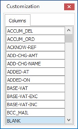 You can add items
into the list by right-clicking the column heading and choose the ‘Field
Choose’ option.
You can add items
into the list by right-clicking the column heading and choose the ‘Field
Choose’ option. 
 The Filter options
work in the same manner as the options for conditional highlights – adding
criteria to restrict the records displayed.
The Filter options
work in the same manner as the options for conditional highlights – adding
criteria to restrict the records displayed. 

 Print Article
 Email Article to Friend