| Home » Categories » Solutions by Business Process » Profiler |
Profiler - Application Landing Pages |
|
Article Number: 2239 | Rating: Unrated | Last Updated: Mon, Jun 19, 2023 at 7:31 PM
|
|
Datafile 2018 and above This new feature extends the option for Landing Pages to ProFiler applications.
You have all the options as per the standard applications – record filters and conditional highlights, definable quick action links, dashboard display. In addition, if the Data Visualisations application is available you also get all the added features of this application.
Installation
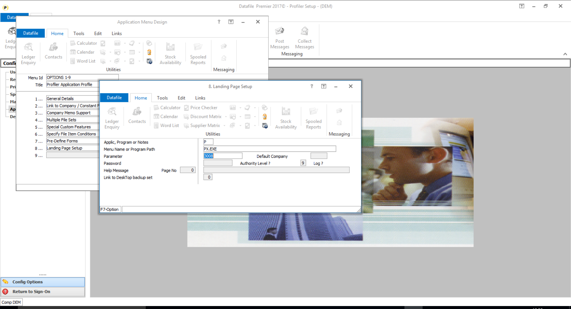
Menu Design
To configure the Landing Page a new option ‘Landing Page Setup’ is available for the ProFiler Application Profiler menu. To add this option, sign on as the CONFIG user and select Application Menu Design and amend the PXAPP.D03
App, Program or Notes – P-Program Menu Name or Program Path – PF.EXE Parameter – 3008
Other options can be set as required.
Configuring the Landing Page
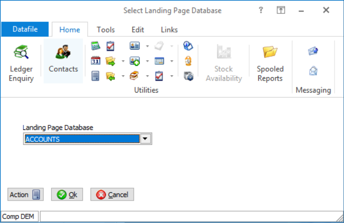
To configure the Landing Page for a ProFiler application, select Database Systems from the main menu followed by ProFiler Application Definition and then Application Profile and Landing Page Setup. The system will automatically select the most recently used application this session, if no application has yet been selected the list of applications will be offered for you.
The first prompt asks you to Select Landing Page Database.
Any of the (maximum of) eight databases in use within the ProFiler application can be chosen as the basis of the landing page.
Select as required.
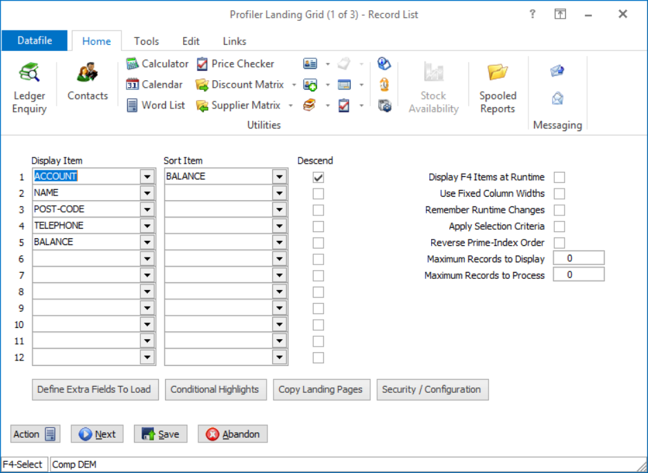
The initial page is like that of the main application landing pages.
Display Item – select up to twelve items from the main application database to be shown by default on the landing grid.
Sort Item (Descending) – select the data items to sort the initial landing page records on. Up to twelve items can be selected, by default these are sorted in ascending order but you can sort in descending order by setting the corresponding flag item.
Display F4 Items at Runtime – If no items are set then the system automatically uses the F4 pick items as the data items list. Setting this option overrides any set items with the F4 pick items also.
Use Fixed Column Widths – set to prevent the user changing the default display widths of the data items listed.
Remember Run Time Changes – set to remember, per user, any changes to display widths made.
Apply Selection Criteria – set to apply any criteria to restrict the records displayed to only those records that match the criteria.
Reverse Prime-Index Order – on smaller databases you may want to set this option to show the latest entry at the top. Generally though where this item likely to be required (Sales Order Processing, Purchase Order Processing or Bill of Materials) you would usually set to sort the list on the Order Reference in descending order. Maximum Records to Display – set to restrict the number of records displayed on the panel.
Maximum Records to Process – set to limit the number of records to process – this applies to the panel and dashboard and is useful to restrict entries where a large volume of historical data is held.
Define Extra Fields to Load
You can select individual items to be available as required – highlighting the item and selecting the ‘>’ icon.
You can set all items to be available by selecting the ‘>>’ icon. You can move items from the Availability list by selecting the ‘<’ and ‘<<’ icons.
Premier options to define authority levels for data items still apply – so you can, for example, allow the stock cost price to be available but if the user does not have authority to view that item they will not be able to view the content of the item.
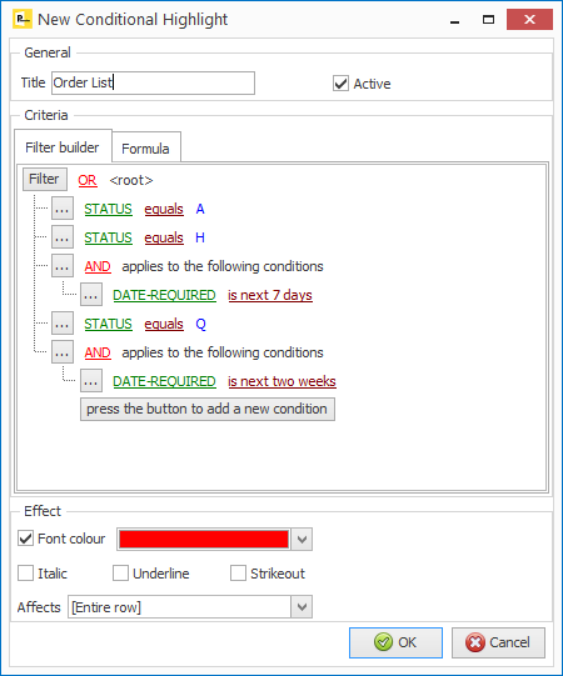
Conditional Highlights
Selecting this option allows you to define the highlight rules to be applied.
There are two types of highlights – Filters or Formula Builders.
Selecting the option displays the existing highlight rules.
To add a new rule right click in blank space and choose to add a condition (you can also press the INS key)
To edit or remove a rule right click the entry and choose as required. If you highlight the rule you can use ENTER key to edit or DEL key to delete.
Rules are applied in the list order – you can move items up or down the list by right-clicking the item and choosing to Move Up/Down as required.
You can disable the highlight by selecting the tick box at the start of each rule. This leaves the rule available to be re-applied later if required.
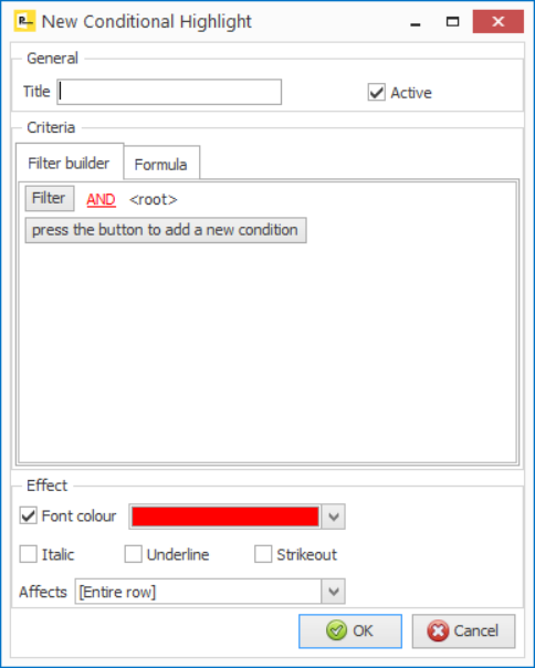
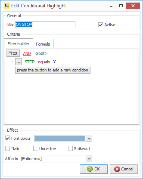
The top section of the display – General - gives the option to define a title for the highlight and to select whether the rule is active.
The bottom section of the display – Effect – allows you to define the visual aspect of the rule.
You can change the Font Colour to the colour specified and/or you can set whet the data is displayed in italics, underlined or in strikeout.
You can also control whether the display affects the entire row or an individual data item in the grid.
There are two types of criteria – Filters or Formula.
The standard options for equal / not equal / greater than / less than and so on are available and will be familiar to users who have used the standard selection criteria options. Other options will be more familiar for those who have defined SQL criteria.
Like / Not Like – this is matching patterns within data and is like the Equal/Not Equal value options in the usual Datafile criteria when using the # wild cards. Here you can enter a value such as %CARD% and will list any of the records where the key item includes CARD, but you can also use C%TEAK – so that key item starts with C but contains TEAK.
In / Not In – allows you to define multiple values so could define that, for example, that the ‘City’ line of an address is in ‘Liverpool’ or ‘Manchester’ and so on.
The values available on criteria change based on the data item type. With Dates for example you get a series of extra options so that can highlight that the date is in the past / future / today and so on.
You can also ‘nest’ conditions – showing, for example, highlight orders where status is Active or Hold or Quote but only show Held Orders where the date required is in the next 7 days, and Quotes only if in the next 14 days, etc.
You use any of the data item names that are defined within the available selection items.
You can also combine criteria so, for example, you could modify the above along the lines of:
((BALANCE + O/S-ORDERS) > CR-LIMIT) AND (CR-LIMIT <> 0)
to show accounts where the balance plus outstanding orders is greater than the credit limit but only when the credit limit is not 0.
Copy Landing Pages
Each user gets the default landing page setup – display items / shared highlights – the first time they use the application. After these amendments, such as adding their own filters, data items, highlights, group items etc. are applied to their landing page alone. This option gives the facility to copy, either individual or all, landing pages from one user to another. For more detail on this option view the System Utilities section of this manual.
Security / Configuration
Only available if the Data Visualisations tool is configured this option allows individual applications to revert to the ‘standard’ landing page setup and to set authority levels for the creation / update of record sets. Again for more detail on this option view the relevant section of this manual.
Define up to 20 actions that are to be displayed above the selected records. For each action you choose
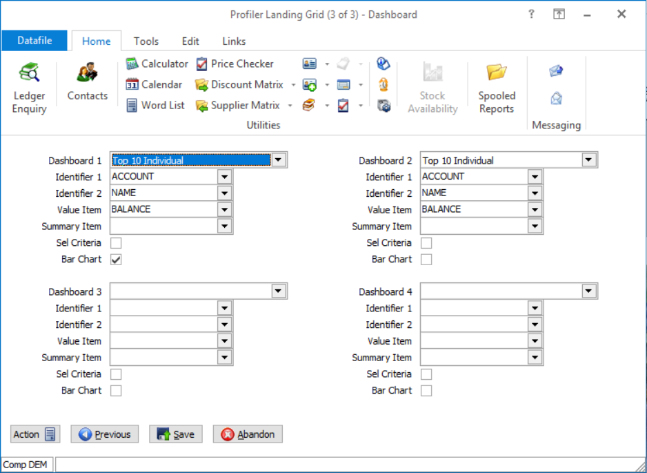
Only applicable where the Data Visualisations tool is not in use this option allows configuration of the Dashboard tab. The first prompt asks you to select the type of Dashboard to display. Options available include:
Identifier 1/2 – only applicable for the Top/Bottom 10 Individual options select items to be displayed as required.
Value Item – applicable for the Individual / Summary option select the item to sort against.
Summary Item – only applicable for the Top/Bottom 10 Summary option select the grouping item to process for. Sel Criteria – applicable for the Individual / Summary options select which of the main application records are to be included in the list / total. Leave blank for all.
Bar Chart – applicable for the Individual / Summary options select if the list is to be displayed as a bar chart instead. |
Attachments

There are no attachments for this article.
|
Related Articles 
Create D03 Menu for this Application
Viewed 1267 times since Thu, Jun 28, 2012
Create New Database
Viewed 1839 times since Fri, Jun 29, 2012
Configuration - User Defined Report Set-up
Viewed 1388 times since Fri, Jun 29, 2012
Sales Ledger Extra Items - EDI Order Processing
Viewed 1230 times since Thu, Jul 5, 2012
Automatic (Q) Menu - Default to Email
Viewed 1410 times since Mon, Jun 11, 2012
Forecast Dates - Additional Options
Viewed 2007 times since Fri, May 27, 2016
User-Defined Reports - *RECCOUNT Test Condition on $Record Control Block
Viewed 2201 times since Mon, Jun 11, 2012
Stock/Product File Extra Items - EDI Order Processing
Viewed 1252 times since Thu, Jul 5, 2012
Extend Number of Menu Entries
Viewed 1420 times since Thu, Jun 28, 2012
E – EDI Definitions
Viewed 722 times since Thu, Jun 28, 2012
|
| Datafile Home | KB Home | Advanced Search |
|
 |
|
|
|
|
|
|
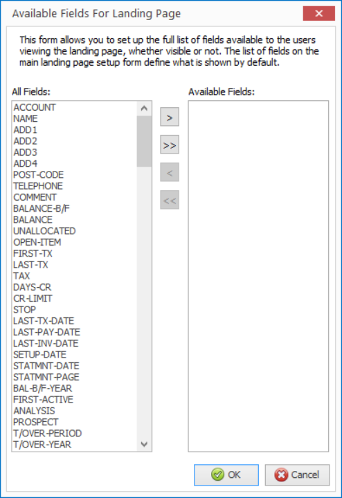 Selecting this
option allows you to define which data items are available to be added by the
operator to the landing grid at run-time and which items conditions, both
individual and shared can be defined against.
Selecting this
option allows you to define which data items are available to be added by the
operator to the landing grid at run-time and which items conditions, both
individual and shared can be defined against. 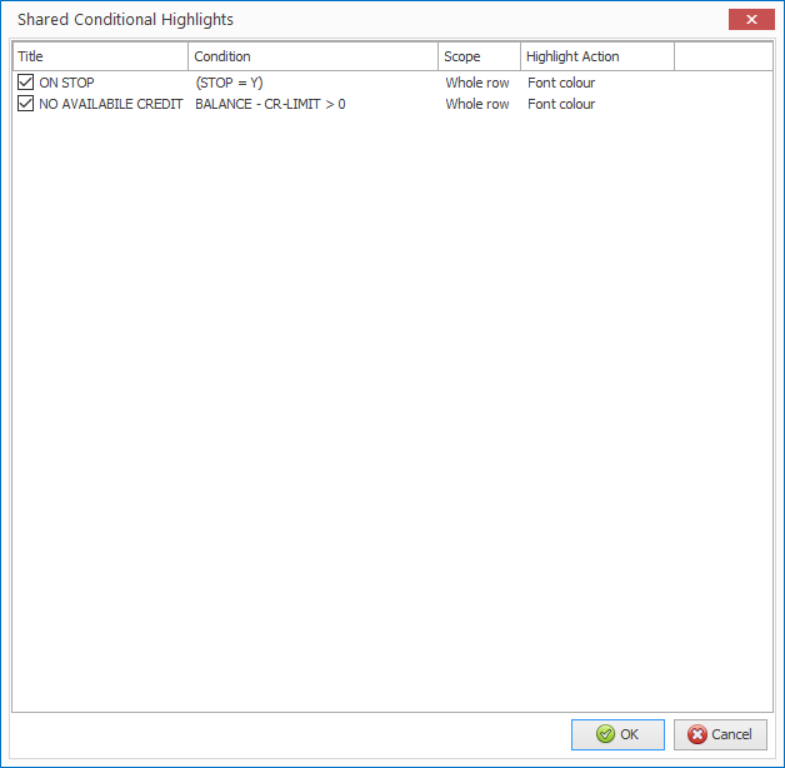
 You can add multiple lines
of criteria = the criteria apply on a ‘AND’ (or Compulsory basis) by default
but you can select the AND option and change to OR as required.
You can add multiple lines
of criteria = the criteria apply on a ‘AND’ (or Compulsory basis) by default
but you can select the AND option and change to OR as required. 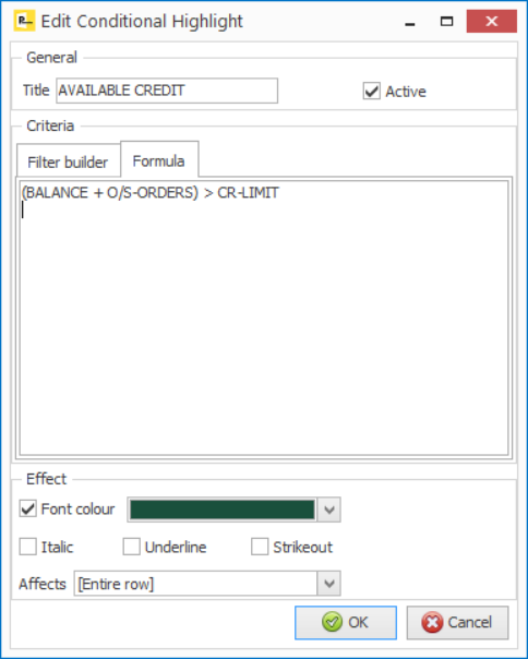 The
The 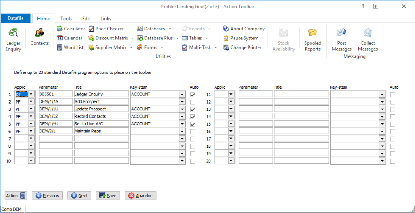
 Print Article
 Email Article to Friend